Build modern web applications withFlowbite Blazor
Flowbite Blazor is an soon-to-be open-source UI component library built on top of Tailwind CSS with Blazor components and based on the Flowbite Design System.


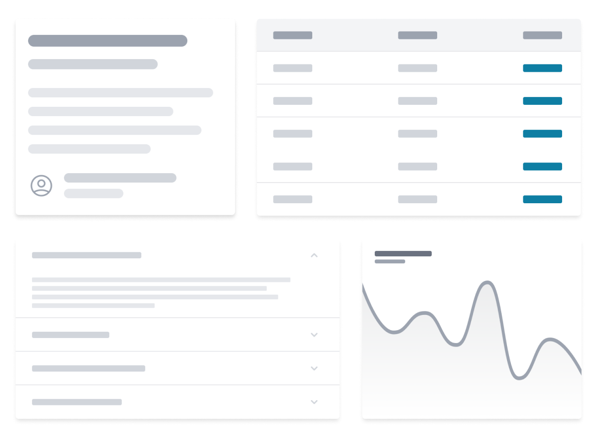
Blazor UI components
Flowbite Blazor is a free and open-source UI component library based on accessible Blazor components and Tailwind CSS.
Get started building modern web applications using the Blazor UI components from Flowbite based on Tailwind CSS and the Flowbite design system by installing the package via NuGet.
- Growing collection of UI components built with Blazor
- Will be open-source under the MIT License
- Compatible with .NET 8.0 or newer
- Utility classes based on Tailwind CSS
- Based on the Flowbite ecosystem and design
- Fully accessible UI components
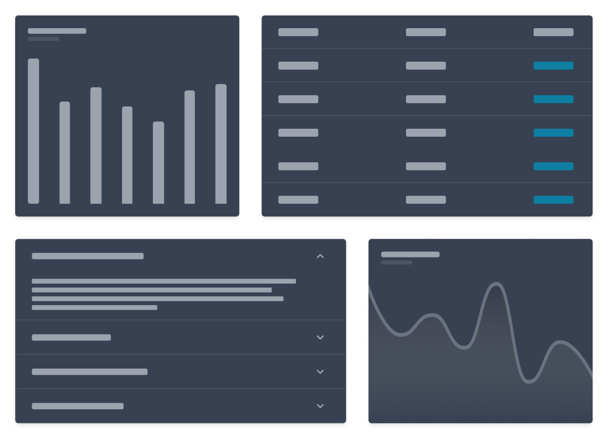
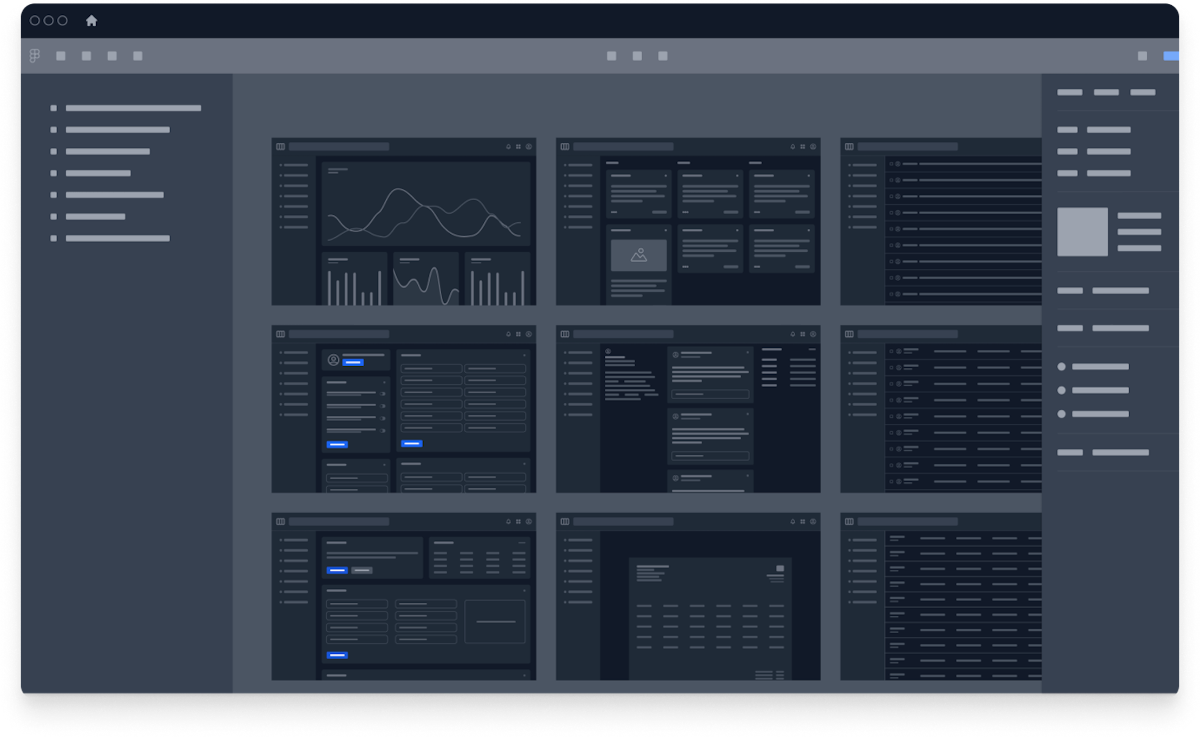
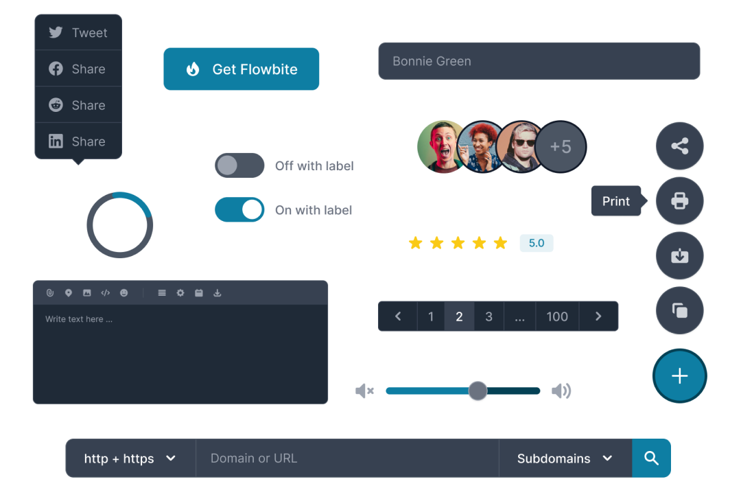
Dark mode integration
Flowbite Blazor has native built-in support for dark mode by using Tailwind CSS and the Flowbite design system.
All of the UI components from Flowbite Blazor will automatically invert the colors when activating dark mode via browser settings or using a custom switcher component.
- Increased accessibility based on room brightness
- Better visibility for users with low vision
- Improved readability for users with light sensitivity
- High quality UI/UX design for modern applications
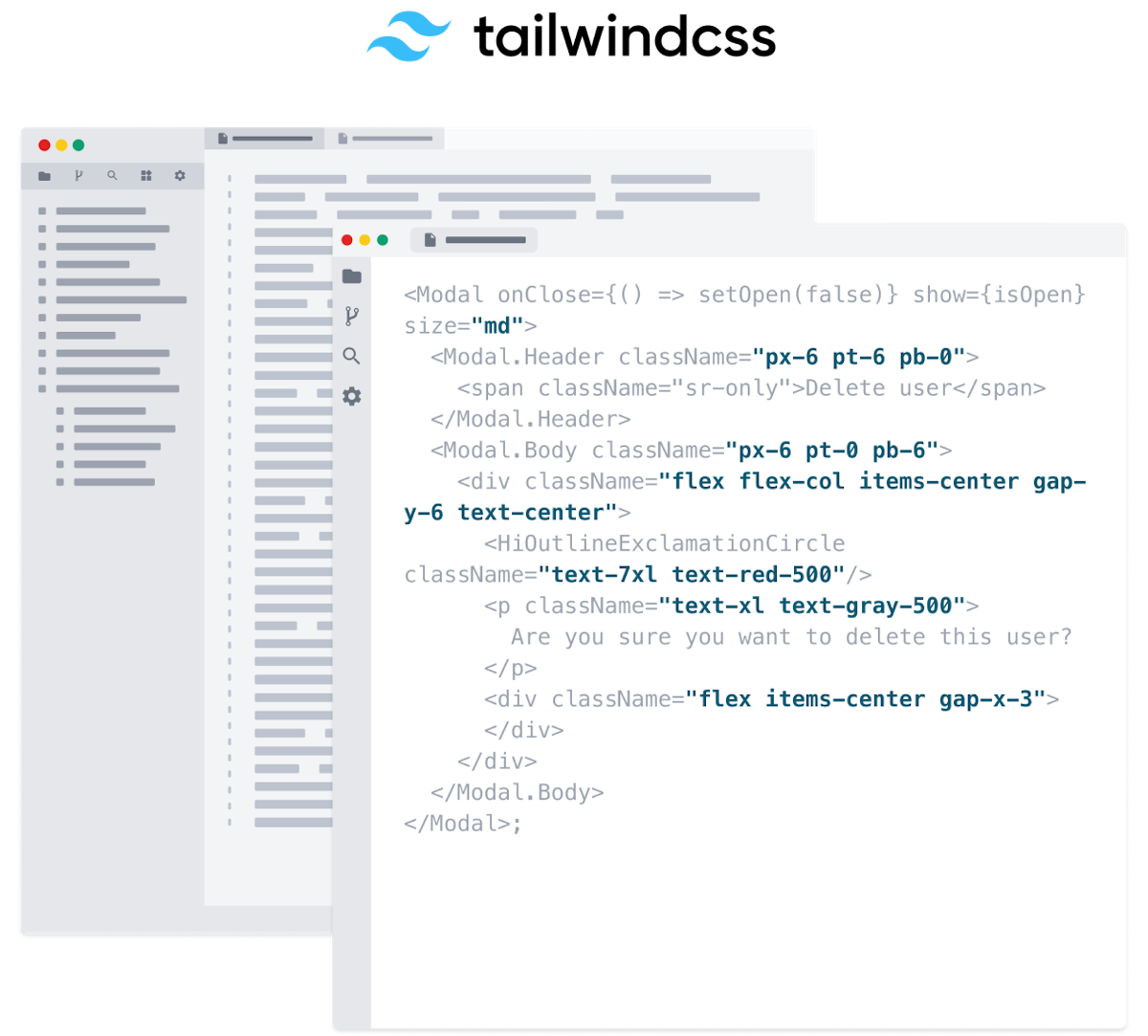
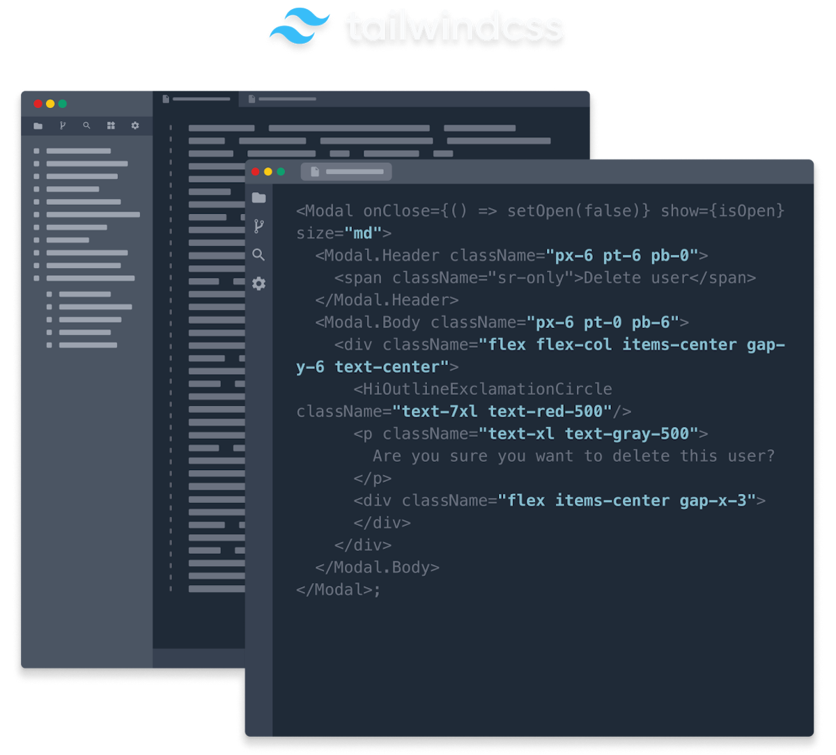
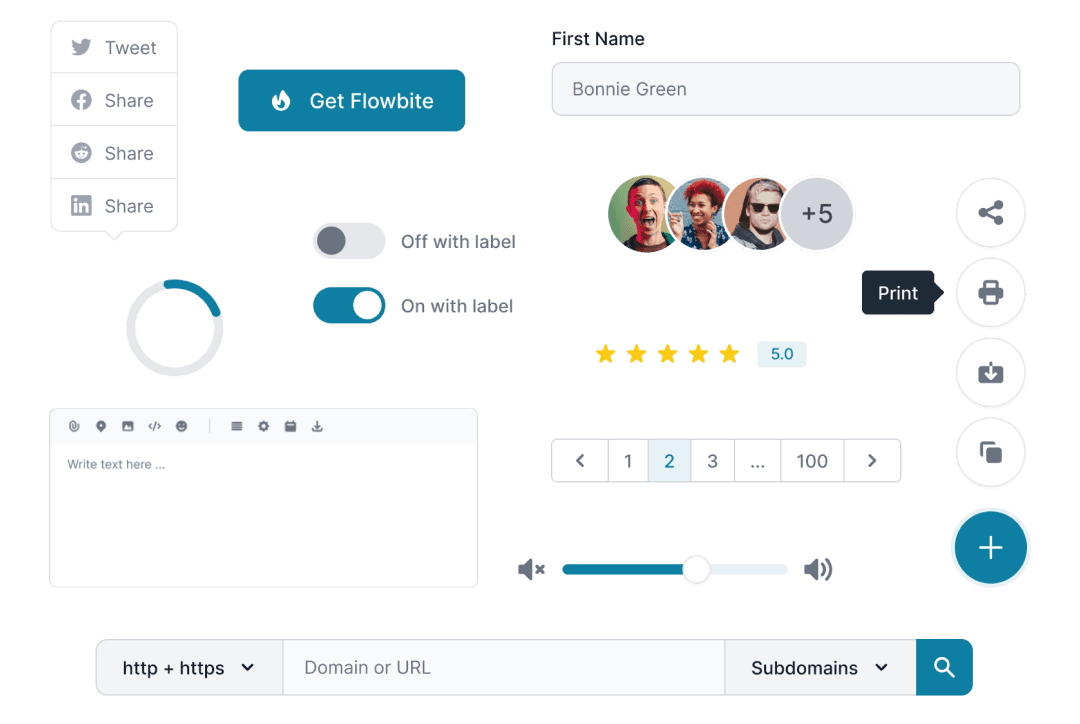
Compatible with Tailwind CSS
Flowbite Blazor uses the utility classes from Tailwind CSS under the hood and provides an advanced theming system that you can use to apply classes to UI components and their underlying HTML elements structure.
This theming system can be used either on an application or component level and Flowbite Blazor also allows you to set up class name attributes on each component.
Tailwind CSS is the most popular and open-source utility-first CSS framework on the market and the Flowbite ecosystem uses this framework in all of the libraries including the vanilla JS, Svelte, Vue, React, and Blazor one.
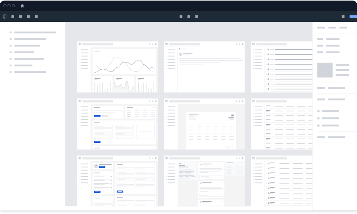
Flowbite provides a robust set of design tokens and components based on the popular Tailwind CSS framework. From the most used UI components like forms and navigation bars to the whole app screens designed both for desktop and mobile, this UI kit provides a solid foundation for any project.
Designing with Figma components that can be easily translated to the utility classes of Tailwind CSS is a huge timesaver!
Design with Figma
Get started with the most popular and definitive design system built in Figma and used by thousands of designers and agencies that is compatible across multiple frameworks in the Flowbite ecosystem including React, Vue, Svelte, and Flowbite.
Check out the following resources to learn more about Flowbite Figma: